
The Second Act Hue Shift: Using Color as a Ritual for Mood, Space, and Self
reimagining color as a guide for midlife renewal
"Color is a translation of the frequency of light. Whenever we look at a color, our body system responds."
—Walaa AlMuhaiteeb
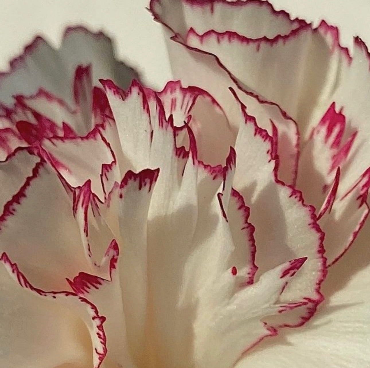
Growing up, many of us first encountered color theory through childhood art classes—learning how red and blue make purple and how color mixing could transform a page. But as we’ve matured, so has our relationship with color. It’s no longer just about pigment—it’s about feeling. The colors we surround ourselves with—in our homes, wardrobes, rituals, and reflections—can influence our emotional landscape in powerful, often subconscious ways. And in midlife, when our internal rhythms shift, learning to tune into that language may offer a surprising renewal.
Do you feel an internal spark when you see a sunflower in full bloom? What about the surge of confidence that comes with a swipe of red lipstick before a night out? These responses are not coincidental—they’re clues. Color has the ability to move us, to balance us, and, at times, to heal. Especially in midlife, when we’re reimagining who we are and how we want to feel, working with color becomes more than a choice—it becomes a ritual.
What Is Color Therapy?
“Color therapy uses the energy frequencies of color and its effects on us emotionally, mentally, and spiritually to guide us into understanding ourselves, our challenges, and how we can unblock and release blocks in the body, spirit, and emotions,” explains Walaa AlMuhaiteeb, a color therapist, energy alchemist, five-modal healer, and founder of The Cringe Method.
AlMuhaiteeb has spent years exploring how color can act as a bridge to self-understanding. To her, it’s not just a visual experience—it’s energetic. “Color is a translation of the frequency of light. Whenever we look at a color, our body system responds,” she says. “For example, when we look at red, our body temperature and blood pressure go up. When we visualize color in our meditations, we dive into our subconscious and begin having conversations that heal trauma, release burdens, and open us up to new possibilities. Eating color has different effects, too. For example, eating orange foods uplifts sadness and brings joy into our bodies.”
Color Archetypes and Personal Frequencies
One of the foundations of AlMuhaiteeb’s practice is discovering our individual color archetype—frequencies tied to our date of birth that help decode emotional patterns and energetic blockages. These archetypes can guide us through midlife transitions with clarity and intention:
- Red: Linked to physical energy, action, and pain release. A call to reclaim stability and power.
- Orange: Tied to joy, creativity, emotional openness, and receiving love. Also, it is a mirror of unresolved loss.
- Yellow Illuminates personal power, mental clarity, and confidence. It is a cue to reconnect with one's inner compass.
- Green: Encourages growth, compassion, and release of old grudges—an invitation to soften into vulnerability.
- Blue: Associated with truth and self-expression. A reminder to own your voice before offering it to the world.
- Indigo: Reflects inner wisdom and intuition. If you’re drawn to this hue, it may be time to trust your own guidance over external noise.
- Violet: Tied to self-love, creativity, and surrendering the ego’s grip. A pathway back to what makes you unique.
A New Chapter in Color: The Respin Evolution
At Respin's 2020 launch, we leaned into a palette of warm, natural tones—soft earth, sun-washed neutrals, and grounding terracottas. We made a conscious choice to meet our community where they were: in a collective pause, seeking calm, stillness, and reconnection.
As the brand evolved, so did the palette. Our recent rebrand introduced a bolder expression of that foundation—vibrant orange, energizing turquoise, lush green, and unapologetic fuchsia. Each color was selected to reflect a woman stepping into her second act with clarity, renewed energy, and the confidence to be seen. It wasn’t just a visual shift—it was a declaration—a reminder that reinvention can be both grounded and bold, soft and strong.
These colors now do more than shape our visual identity—they inform how we show up. Every aspect of our programming, from the tone of our coaches to the way we structure each workshop or webinar, is guided by this palette. Orange inspires movement and bold action. Turquoise encourages calm, openness, and clear communication. Green supports restoration, growth, and self-trust. Fuchsia invites joy, expression, and visibility. Each hue acts as a compass—helping us meet our community exactly where they are while guiding them toward where they want to go.
And when you see these colors appear across our Instagram feed, they’re more than aesthetic. They’re an invitation. A call to action. This a signal that what we’re offering is designed with the intention—to move, support, and inspire your second act.
Color as a Daily Wellness Ritual
According to AlMuhaiteeb, we’re in constant conversation with color—whether we realize it or not. “Color therapy guides us to translate the frequency of color,” she explains. “Each color we are attracted to tells us a story about our deepest desires… while each color we are repelled by tells a similar story of what we are avoiding.”
In practice, this means tuning into how colors make you feel in the body and asking what a color might be reflecting back to you. Do you crave green because you need growth? Are you avoiding orange because it asks you to feel?
You can begin integrating color therapy into daily life with subtle, meaningful rituals—what you wear, how you decorate, and the pigments in your beauty choices. “When you’re not in the mood to socialize but have to, wearing peach or orange can uplift your body and help you become more open,” AlMuhaiteeb shares. “When you want to avoid absorbing other people’s energy, many reach for black—but black absorbs everything. White, instead, deflects. It protects while keeping your energy clear.”
And when in doubt? Red lipstick. “It re-energizes and brings passion to your day.”
Seasonal Shifts and the Energy of Summer
As the seasons change, so does our internal landscape. Winter encourages stillness and rest, while spring invites awakening. Summer, with its expansive light and saturated hues, supports forward motion. It’s no surprise that pastels—softened versions of core archetypes—begin to show up this time of year. They invite us to move with intention and lightness.
Pastel yellows symbolize faith and boldness, while peaches ask us to trust our intuition. Lilacs remind us to soften and receive. Even in their delicacy, these colors carry purpose.
“Notice the colors around you,” AlMuhaiteeb suggests. “Don’t just look—feel. What are they awakening in you? What are they reminding you of? Begin your relationship with color so you can use it in different aspects of your life.”
The Second Act Is Not Black and White—It’s Bold and Bright
Midlife isn’t a fading out—it’s a blooming into. And color, in all its nuance, helps us remember the parts of ourselves we’ve left behind—or never fully claimed. Whether it’s turquoise to clear the path, orange to warm the edges, or fuchsia to speak without apology, there’s a frequency for where you are and where you’re going.
In this season of life, we’re not blending into the background—we’re stepping into sharper focus. Every shade we choose, every color we embody, is a declaration of presence. The second act isn’t about playing small. It’s about becoming the most vivid version of ourselves—one hue, feeling, and bold choice at a time. Let the colors call you forward.
